
.af-replica-slot--home { display: contents; }
/* Non-home: opaque canvas covers body collage so content is not "in front of" header art */
.af-replica-slot--page {
display: block;
position: relative;
z-index: 1;
width: 100%;
min-height: 40vh;
background-color: #1a1a1a;
background-image: none;
}
/*
* Uniform Game Thumbnail Covers (Poster ratio).
* Lock 584:800 box-art ratio and ensure uniform sizing across all cards.
*/
.mag-box .posts-items li .post-thumb,
.mag-box.big-posts-box .posts-items li .post-thumb,
.posts-items .post-thumb,
.posts-list-container .post-thumb,
.post-item .post-thumb,
a.post-thumb {
display: block !important;
width: 100% !important;
aspect-ratio: 584 / 800 !important;
position: relative !important;
overflow: hidden !important;
border-radius: 8px !important;
background: #191722 !important;
box-shadow: 0 4px 12px rgba(0, 0, 0, 0.4) !important;
}
.mag-box .posts-items li .post-thumb img,
.mag-box.big-posts-box .posts-items li .post-thumb img,
.posts-items .post-thumb img,
.posts-list-container .post-thumb img,
.post-item .post-thumb img,
a.post-thumb img,
img.thumbnail-image {
position: absolute !important;
inset: 0 !important;
width: 100% !important;
height: 100% !important;
object-fit: cover !important;
object-position: center center !important;
border-radius: 8px !important;
}
/* Multi-column responsive CSS Grid for magazine boxes */
.mag-box.big-posts-box .posts-items.posts-list-container,
.mag-box .posts-items.posts-list-container {
display: grid !important;
grid-template-columns: repeat(6, minmax(0, 1fr)) !important;
gap: 16px !important;
width: 100% !important;
box-sizing: border-box !important;
list-style: none !important;
padding: 0 !important;
margin: 0 0 25px 0 !important;
}
.mag-box.big-posts-box .posts-items li.post-item,
.mag-box .posts-items li.post-item {
width: 100% !important;
max-width: 100% !important;
margin: 0 !important;
padding: 0 !important;
float: none !important;
box-sizing: border-box !important;
}
@media (max-width: 1200px) {
.mag-box.big-posts-box .posts-items.posts-list-container,
.mag-box .posts-items.posts-list-container {
grid-template-columns: repeat(4, minmax(0, 1fr)) !important;
gap: 14px !important;
}
}
@media (max-width: 768px) {
.mag-box.big-posts-box .posts-items.posts-list-container,
.mag-box .posts-items.posts-list-container {
grid-template-columns: repeat(3, minmax(0, 1fr)) !important;
gap: 12px !important;
}
}
@media (max-width: 480px) {
.mag-box.big-posts-box .posts-items.posts-list-container,
.mag-box .posts-items.posts-list-container {
grid-template-columns: repeat(2, minmax(0, 1fr)) !important;
gap: 10px !important;
}
}
/* ── Archive & Category Page Enhancements ── */
.archive-box .mag-box-title {
display: flex !important;
align-items: center !important;
justify-content: space-between !important;
margin-bottom: 20px !important;
}
.archive-box .archive-count-badge {
font-size: 13px !important;
color: #a8a8b4 !important;
font-weight: 500 !important;
background: rgba(255, 255, 255, 0.05) !important;
padding: 4px 12px !important;
border-radius: 12px !important;
border: 1px solid rgba(255, 255, 255, 0.08) !important;
}
#tie-breadcrumb,
.tie-breadcrumbs {
font-size: 13.5px !important;
color: #8f929b !important;
margin: 16px 0 20px 0 !important;
display: flex !important;
align-items: center !important;
gap: 8px !important;
padding: 0 !important;
}
#tie-breadcrumb a,
.tie-breadcrumbs a {
color: #d1d5db !important;
text-decoration: none !important;
transition: color 0.2s ease !important;
}
#tie-breadcrumb a:hover,
.tie-breadcrumbs a:hover {
color: #733d91 !important;
}
#tie-breadcrumb .delimiter,
.tie-breadcrumbs .delimiter {
color: #6366f1 !important;
font-weight: 700 !important;
margin: 0 4px !important;
}
#tie-breadcrumb .tie-current,
.tie-breadcrumbs .tie-current {
color: #ffffff !important;
font-weight: 600 !important;
}
/* ── WP-PageNavi & Jannah Archive Pagination ── */
.wp-pagenavi,
.pages-nav .pages-numbers {
display: flex !important;
align-items: center !important;
justify-content: center !important;
flex-wrap: wrap !important;
gap: 8px !important;
padding: 28px 0 16px !important;
margin: 0 auto !important;
font-size: 14px !important;
font-weight: 600 !important;
}
.wp-pagenavi span.pages {
color: #a8a8b4 !important;
font-size: 13px !important;
font-weight: 500 !important;
padding: 6px 14px !important;
background: rgba(255, 255, 255, 0.04) !important;
border: 1px solid rgba(255, 255, 255, 0.08) !important;
border-radius: 6px !important;
margin-right: 4px !important;
}
.wp-pagenavi a,
.wp-pagenavi span.current,
.wp-pagenavi span.extend {
display: inline-flex !important;
align-items: center !important;
justify-content: center !important;
min-width: 38px !important;
height: 38px !important;
padding: 0 12px !important;
border-radius: 6px !important;
box-sizing: border-box !important;
text-decoration: none !important;
transition: all 0.2s ease !important;
}
.wp-pagenavi a {
color: #d1d5db !important;
background: #1e1d28 !important;
border: 1px solid rgba(255, 255, 255, 0.1) !important;
}
.wp-pagenavi a:hover {
color: #ffffff !important;
background: #733d91 !important;
border-color: #733d91 !important;
box-shadow: 0 4px 12px rgba(115, 61, 145, 0.4) !important;
transform: translateY(-1px) !important;
}
.wp-pagenavi span.current {
color: #ffffff !important;
background: #733d91 !important;
border: 1px solid #733d91 !important;
box-shadow: 0 2px 8px rgba(115, 61, 145, 0.35) !important;
cursor: default !important;
}
.wp-pagenavi span.extend {
color: #71717a !important;
border: none !important;
background: transparent !important;
min-width: 20px !important;
}
/* Top Featured Slider Fallback & Uniformity */
.slider-area.mag-box {
margin-bottom: 28px !important;
width: 100% !important;
}
.tie-main-slider .tie-slick-slider,
.slider-area-inner .tie-slick-slider,
.tie-main-slider .main-slider-inner {
width: 100% !important;
}
.tie-main-slider .tie-slick-slider:not(.slick-initialized) {
display: grid !important;
grid-template-columns: repeat(4, minmax(0, 1fr)) !important;
gap: 14px !important;
width: 100% !important;
overflow: hidden !important;
}
.tie-main-slider .slide,
.tie-slick-slider .slide,
.main-slider-inner .slide {
aspect-ratio: 584 / 800 !important;
min-height: 380px !important;
max-height: 480px !important;
border-radius: 15px !important;
overflow: hidden !important;
background-size: cover !important;
background-position: center center !important;
position: relative !important;
}
@media (max-width: 991px) {
.tie-main-slider .tie-slick-slider:not(.slick-initialized) {
grid-template-columns: repeat(2, minmax(0, 1fr)) !important;
}
}
@media (max-width: 480px) {
.tie-main-slider .tie-slick-slider:not(.slick-initialized) {
grid-template-columns: repeat(1, minmax(0, 1fr)) !important;
}
}
/*
* Universal SU portrait covers (My Library / Top Downloads / Trending /
* homepage cover grids / related cards). Lock 287×383 box-art ratio and
* never stretch via object-fit:fill from theme CSS.
*/
/* Grid layout only for non-homepage pages (My Library / Top Downloads / Trending).
* The homepage uses the source site's flex layout for .homepage-cover-items — do NOT
* override display there or it collapses the nested double-open div structure. */
.mdw-grid.homepage-cover-items,
.homepage-cover-items.mdw-grid,
.su-trending-grid.mdw-grid {
display: grid !important;
grid-template-columns: repeat(auto-fill, minmax(175px, 1fr)) !important;
justify-content: center;
justify-items: center;
align-items: start;
gap: 14px;
}
.mdw-grid .cover-item,
.su-trending-grid .cover-item {
width: 100% !important;
max-width: 220px !important;
margin: 0 !important;
align-self: start !important;
position: relative;
overflow: hidden;
}
/*
* Nested cover-items safety (prefix used to double-open; still harmless if present).
*/
.homepage-cover-items > .homepage-cover-items {
width: 100% !important;
flex: 1 1 100% !important;
}
/* Homepage cover rhythm — match source responsive columns, keep cards left-packed. */
body.home .homepage-category,
body.home .page.homepage > .container,
body.home .homepage-search-block > .container {
margin-left: auto !important;
margin-right: auto !important;
max-width: 1170px;
width: 100%;
box-sizing: border-box;
}
body.home .homepage-cover-items {
display: flex !important;
flex-wrap: wrap !important;
justify-content: flex-start !important;
gap: 14px 1.2% !important;
width: 100% !important;
box-sizing: border-box;
}
body.home .homepage-cover-items .cover-item {
flex: 0 0 calc((100% - (5 * 1.2%)) / 6) !important;
max-width: none !important;
margin: 0 0 25px !important;
box-sizing: border-box;
}
/* Tablet 641–990: 4 columns so cards don't crush/vanish */
@media (min-width: 641px) and (max-width: 990px) {
body.home .homepage-cover-items {
gap: 12px 1.5% !important;
padding: 0 12px !important;
}
body.home .homepage-cover-items .cover-item {
flex: 0 0 calc((100% - (3 * 1.5%)) / 4) !important;
margin-bottom: 18px !important;
}
body.home .homepage-category,
body.home .page.homepage > .container,
body.home .homepage-search-block > .container {
padding-left: 12px !important;
padding-right: 12px !important;
}
}
/* 481–640: 3 columns (source) */
@media (min-width: 481px) and (max-width: 640px) {
body.home .homepage-cover-items {
display: grid !important;
grid-template-columns: repeat(3, minmax(0, 1fr)) !important;
gap: 12px 14px !important;
padding: 0 16px !important;
}
body.home .homepage-cover-items .cover-item {
flex: none !important;
width: 100% !important;
margin: 0 !important;
}
body.home .homepage-category {
padding-left: 16px !important;
padding-right: 16px !important;
}
}
/* ≤480: 2 columns (source) */
@media (max-width: 480px) {
body.home .homepage-cover-items {
display: grid !important;
grid-template-columns: repeat(2, minmax(0, 1fr)) !important;
gap: 10px 12px !important;
padding: 0 14px !important;
}
body.home .homepage-cover-items .cover-item {
flex: none !important;
width: 100% !important;
margin: 0 !important;
}
body.home .homepage-category {
padding-left: 14px !important;
padding-right: 14px !important;
}
}
/* Link+img pattern (Top Downloads / My Library / Trending) */
.mdw-grid .cover-item-link,
.homepage-cover-items .cover-item-link,
.su-trending-grid .cover-item-link {
display: block !important;
width: 100% !important;
position: relative !important;
overflow: hidden;
}
.mdw-grid .cover-item-link::before,
.homepage-cover-items .cover-item-link::before,
.su-trending-grid .cover-item-link::before {
content: "" !important;
display: block !important;
width: 100% !important;
aspect-ratio: 287 / 383 !important;
}
.mdw-grid .cover-item-link > img,
.mdw-grid .cover-item-link .wp-post-image,
.homepage-cover-items .cover-item-link > img,
.homepage-cover-items .cover-item-link .wp-post-image,
.su-trending-grid .cover-item-link > img,
.su-trending-grid .cover-item-link .wp-post-image {
position: absolute !important;
inset: 0 !important;
width: 100% !important;
height: 100% !important;
max-width: none !important;
max-height: none !important;
object-fit: cover !important;
object-position: center center !important;
aspect-ratio: auto !important;
}
/* Homepage replica cards: a.cover-item > .cover-item-image > img */
.homepage-cover-items > a.cover-item .cover-item-image,
.homepage-cover-items .cover-item .cover-item-image {
display: block !important;
width: 100% !important;
aspect-ratio: 287 / 383 !important;
overflow: hidden !important;
position: relative !important;
background: #111;
}
.homepage-cover-items > a.cover-item .cover-item-image > img,
.homepage-cover-items .cover-item .cover-item-image > img {
position: absolute !important;
inset: 0 !important;
width: 100% !important;
height: 100% !important;
max-width: none !important;
max-height: none !important;
object-fit: cover !important;
object-position: center center !important;
aspect-ratio: auto !important;
}
.su-related-thumb,
.su-cat__card-img {
aspect-ratio: 287 / 383 !important;
overflow: hidden;
}
.su-related-thumb img,
.su-cat__card-img img,
img.su-cover-img {
width: 100% !important;
height: 100% !important;
object-fit: cover !important;
object-position: center center !important;
}
@media (max-width: 991px) {
.mdw-grid.homepage-cover-items,
.homepage-cover-items.mdw-grid,
.su-trending-grid.mdw-grid {
grid-template-columns: repeat(auto-fill, minmax(150px, 1fr)) !important;
}
.mdw-grid .cover-item,
.su-trending-grid .cover-item {
max-width: 200px !important;
}
}
@media (max-width: 640px) {
.mdw-grid.homepage-cover-items,
.homepage-cover-items.mdw-grid,
.su-trending-grid.mdw-grid {
grid-template-columns: repeat(auto-fill, minmax(130px, 1fr)) !important;
gap: 10px !important;
}
.mdw-grid .cover-item,
.su-trending-grid .cover-item {
max-width: 180px !important;
}
}
/* Home suffix can leak orphan listing cards outside the grid UL. */
.af-replica-slot > li.post-item,
.af-replica-slot > .post-item {
display: none !important;
}
/* Keep homepage listing grids tight when the last row is short. */
.mag-box.big-posts-box .mag-box-container,
.mag-box.big-posts-box .posts-list-container {
min-height: 0 !important;
}
.mag-box.big-posts-box .container-wrapper {
height: auto !important;
min-height: 0 !important;
}
/* Dark skin: enforce dark gaming palette across container & cards */
html.dark-skin, body.dark-skin {
background-color: #121017 !important;
color: #ffffff !important;
}
html.dark-skin #tie-wrapper,
body.dark-skin #tie-wrapper {
background-color: #181621 !important;
}
html.dark-skin .container-wrapper,
body.dark-skin .container-wrapper {
background-color: #1f1d2b !important;
border: 1px solid rgba(255, 255, 255, 0.08) !important;
color: #ffffff !important;
}
/* Match source light-mode opaque content cards when in light skin */
html:not(.dark-skin):not(:has(.su-cat-page)):not(:has(.navbar.navbar-inverse #menuid)):not(.su-native-shell) #tie-wrapper {
background-color: #ffffff !important;
}
html:not(.dark-skin):not(:has(.su-cat-page)):not(:has(.navbar.navbar-inverse #menuid)):not(.su-native-shell) #content .container-wrapper:not(.post-element),
html:not(.dark-skin):not(:has(.su-cat-page)):not(:has(.navbar.navbar-inverse #menuid)):not(.su-native-shell) #tie-wrapper .section-wrapper .container-wrapper,
html:not(.dark-skin):not(:has(.su-cat-page)):not(:has(.navbar.navbar-inverse #menuid)):not(.su-native-shell) .main-content .container-wrapper:not(.post-element),
html:not(.dark-skin):not(:has(.su-cat-page)):not(:has(.navbar.navbar-inverse #menuid)):not(.su-native-shell) aside.sidebar .container-wrapper,
html:not(.dark-skin):not(:has(.su-cat-page)):not(:has(.navbar.navbar-inverse #menuid)):not(.su-native-shell) #the-post.container-wrapper,
html:not(.dark-skin):not(:has(.su-cat-page)):not(:has(.navbar.navbar-inverse #menuid)):not(.su-native-shell) .post-content.container-wrapper,
html:not(.dark-skin):not(:has(.su-cat-page)):not(:has(.navbar.navbar-inverse #menuid)):not(.su-native-shell) #posts-list-widget-4.container-wrapper,
html:not(.dark-skin):not(:has(.su-cat-page)):not(:has(.navbar.navbar-inverse #menuid)):not(.su-native-shell) #related-posts.container-wrapper {
background-color: #ffffff !important;
background-image: none !important;
border: 1px solid rgba(0, 0, 0, 0.08) !important;
border-radius: 12px !important;
box-shadow: 0 4px 15px rgba(0, 0, 0, 0.06) !important;
color: #2c2f34 !important;
}
html:not(.dark-skin):not(:has(.su-cat-page)):not(:has(.navbar.navbar-inverse #menuid)):not(.su-native-shell):not(:has(.wp-theme-jannah)) .mag-box-title h3,
html:not(.dark-skin):not(:has(.su-cat-page)):not(:has(.navbar.navbar-inverse #menuid)):not(.su-native-shell):not(:has(.wp-theme-jannah)) .widget-title h3,
html:not(.dark-skin):not(:has(.su-cat-page)):not(:has(.navbar.navbar-inverse #menuid)):not(.su-native-shell):not(:has(.wp-theme-jannah)) h1,
html:not(.dark-skin):not(:has(.su-cat-page)):not(:has(.navbar.navbar-inverse #menuid)):not(.su-native-shell):not(:has(.wp-theme-jannah)) h2:not(.the-post-title),
html:not(.dark-skin):not(:has(.su-cat-page)):not(:has(.navbar.navbar-inverse #menuid)):not(.su-native-shell):not(:has(.wp-theme-jannah)) h3,
html:not(.dark-skin):not(:has(.su-cat-page)):not(:has(.navbar.navbar-inverse #menuid)):not(.su-native-shell):not(:has(.wp-theme-jannah)) h4 {
color: #1a1a1a !important;
}
/* Category/search media tiles must stay borderless (source masonry). */
.media-page-layout .post-element.container-wrapper,
#masonry-grid .post-element.container-wrapper {
background: transparent !important;
border: 0 !important;
box-shadow: none !important;
border-radius: 0 !important;
padding: 0 !important;
}
.media-page-layout .post-element .slide {
border-radius: 12px;
overflow: hidden;
background-size: cover !important;
background-position: center center !important;
aspect-ratio: 584 / 800;
min-height: 260px;
height: auto !important;
position: relative !important;
}
/* Overlay masonry: theme JS expects absolute tiles; we force a flex grid
without requiring WordPress body classes (.archive.category). */
#masonry-grid.masonry-loaded,
.media-page-layout #masonry-grid {
height: auto !important;
display: flex !important;
flex-wrap: wrap !important;
gap: 15px;
align-items: stretch;
}
#masonry-grid .post-element,
.media-page-layout #masonry-grid .post-element {
position: relative !important;
top: auto !important;
left: auto !important;
right: auto !important;
bottom: auto !important;
transform: none !important;
flex: 0 0 calc(20% - 12px);
width: calc(20% - 12px);
max-width: calc(20% - 12px);
margin: 0 !important;
opacity: 1 !important;
float: none !important;
}
/* Overlay layout already shows .thumb-title — hide duplicate red title. */
#masonry-grid .the-post-title,
.media-page-layout .the-post-title {
display: none !important;
}
#masonry-grid .thumb-overlay,
.media-page-layout .thumb-overlay {
position: absolute !important;
inset: 0;
display: flex !important;
flex-direction: column;
justify-content: flex-end;
padding: 12px;
box-sizing: border-box;
background: linear-gradient(to top, rgba(0,0,0,.72) 0%, rgba(0,0,0,.15) 45%, transparent 70%);
}
#masonry-grid .thumb-title,
#masonry-grid .thumb-title a,
.media-page-layout .thumb-title,
.media-page-layout .thumb-title a {
color: #fff !important;
text-shadow: 0 1px 2px rgba(0,0,0,.55);
}
@media (max-width: 991px) {
#masonry-grid .post-element,
.media-page-layout #masonry-grid .post-element {
flex: 0 0 calc(33.333% - 10px);
width: calc(33.333% - 10px);
max-width: calc(33.333% - 10px);
}
}
@media (max-width: 670px) {
#masonry-grid .post-element,
.media-page-layout #masonry-grid .post-element {
flex: 0 0 100%;
width: 100%;
max-width: 100%;
}
}
/* Footer nest inside home section-wrapper — beat white card rules. */
html #footer.site-footer .container-wrapper,
html #footer.dark-skin .container-wrapper,
html:not(.dark-skin) #tie-wrapper .section-wrapper #footer .container-wrapper,
html:not(.dark-skin) .main-content #footer .container-wrapper,
html:not(.dark-skin) #footer .container-wrapper,
html:not(.dark-skin) #footer-widgets-container .container-wrapper,
#footer .container-wrapper,
#footer-widgets-container .container-wrapper {
background-color: transparent !important;
background-image: none !important;
border: none !important;
box-shadow: none !important;
color: #ffffff !important;
/* Captured third-party comment iframes inflate page height — collapse. */
.tolstoycomments-feed,
[id^="tolstoycomments"],
.fb-comments,
#comments.comments-area:empty {
display: none !important;
height: 0 !important;
max-height: 0 !important;
overflow: hidden !important;
margin: 0 !important;
padding: 0 !important;
}
/* SteamUnlocked catbar: flex cards must scroll inside column, not widen page */
.hp-section.hp-catbar,
section.hp-catbar {
max-width: 100%;
width: 100%;
min-width: 0 !important;
overflow: hidden;
box-sizing: border-box;
}
.hp-catbar__track {
max-width: 100% !important;
width: 100% !important;
min-width: 0 !important;
overflow-x: auto !important;
box-sizing: border-box;
}
.hp-catbar__card {
flex: 0 0 280px;
}
/* ── Universal Mobile Responsive Layout for Blogger / GamePs3 / Desktop Clones ── */
@media (max-width: 1240px) {
#outer-wrapper,
.content-wrapper,
#header-wrapper,
#content-wrapper {
width: 100% !important;
max-width: 100% !important;
box-sizing: border-box !important;
}
}
@media (max-width: 1024px) {
#sidebar-narrow {
width: 100% !important;
max-width: 100% !important;
float: none !important;
margin: 0 0 15px 0 !important;
clear: both !important;
}
#sidebar-narrow .widget.Label ul,
#sidebar-narrow ul#menu-menu-ben-trai {
display: flex !important;
flex-wrap: wrap !important;
gap: 6px !important;
padding: 0 !important;
margin: 0 !important;
list-style: none !important;
}
#sidebar-narrow .widget.Label ul li,
#sidebar-narrow ul#menu-menu-ben-trai li {
display: inline-block !important;
margin: 0 !important;
padding: 0 !important;
}
#sidebar-narrow .widget.Label ul li a,
#sidebar-narrow ul#menu-menu-ben-trai li a {
display: inline-block !important;
padding: 6px 12px !important;
font-size: 13px !important;
border-radius: 4px !important;
}
#main-wrapper {
width: 100% !important;
float: none !important;
border-right: none !important;
box-sizing: border-box !important;
}
#sidebar-wrapper, #sidebar1-wrapper {
width: 100% !important;
float: none !important;
padding: 15px 10px !important;
box-sizing: border-box !important;
}
#header-wrapper {
width: 100% !important;
height: auto !important;
}
#header {
width: 100% !important;
float: none !important;
text-align: center !important;
}
}
@media (max-width: 768px) {
html, body {
overflow-x: hidden !important;
max-width: 100vw !important;
}
#outer-wrapper {
margin: 0 !important;
padding: 0 6px !important;
width: 100% !important;
}
.post {
margin: 8px 0 !important;
padding: 12px !important;
box-sizing: border-box !important;
}
/* Grid cards responsive: 2 columns on tablet/large mobile */
.bar {
width: calc(50% - 10px) !important;
margin: 5px !important;
box-sizing: border-box !important;
float: left !important;
height: auto !important;
}
.bar .post-body {
width: 100% !important;
height: auto !important;
}
.bar img {
max-width: 92% !important;
height: auto !important;
margin: 8px auto !important;
}
/* Navigation menu touch scrolling */
#main_menu, #menu, .menu, nav.site-nav {
width: 100% !important;
overflow-x: auto !important;
-webkit-overflow-scrolling: touch !important;
}
/* Comments responsive */
#comments, #wpdcom {
width: 100% !important;
max-width: 100% !important;
padding: 0 6px !important;
box-sizing: border-box !important;
}
.wpd-form-row {
flex-direction: column !important;
}
}
@media (max-width: 480px) {
.bar {
width: 100% !important;
margin: 8px 0 !important;
float: none !important;
height: auto !important;
}
.post h1.post-title, .post h2.post-title {
font-size: 16px !important;
line-height: 1.25em !important;
}
.entry-content table {
font-size: 12px !important;
}
.wpd-comment-footer {
flex-wrap: wrap !important;
}
}
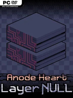
Anode Heart: Layer Null (v1.0.1)
Game Overview
A strange digital layer turns every disagreement into a duel, making card battles feel less like a side activity and more like the law of the land. Anode Heart: Layer Null shifts the series away from monster-taming adventuring and builds a focused deck-building RPG around the Duel Server, an enigmatic network where newcomer Blank fights upward through competitive ranks. Its low-resolution isometric look recalls Game Boy Color and early PlayStation RPGs, but the tone carries a surreal cyber-fantasy edge, complete with uneasy rivals, cryptic systems, and the lurking Shadowed organization. The story stands on its own, so returning characters and references reward existing fans without shutting out newcomers.
Matches revolve around assembling a deck from more than 500 collectible cards, then learning how individual effects, synergies, and counterplays work against increasingly demanding opponents. Booster packs steadily expand the available card pool, while rebalanced sets and refined rules give the former mini-game enough depth to support an entire campaign. Twelve distinct areas lead to specialized card bosses that demand smarter deck adjustments rather than simple grinding, and the Server Rank system provides a clear goal as Blank pushes toward the top. Alongside dueling, players collect Tama monster DNA, tying the game back to the broader Anode Heart universe and adding another layer of collection-driven progression. Local and direct-connection PvP also let two players test decks against each other outside the story.
Layer Null stands out because it treats its card game as a proper RPG discipline: every character, conflict, and region feeds back into the idea that mastery of the deck defines status. The compact retro presentation gives the campaign personality without burying its tactical information under excessive effects or interface clutter. Players who enjoy the experimentation of Pokémon Trading Card Game, Yu-Gi-Oh!, or deck-focused RPGs will find plenty to dissect in its huge card catalogue and boss encounters. It suits newcomers looking for a self-contained card-battling adventure, while veterans gain a lore-rich bridge toward the series’ next major chapter.
Installation
Click the green button below to be redirected to UploadHaven.
Wait 15 seconds, then hit “Free Download.” (Free downloads may be slower — upgrade to UploadHaven Pro for faster speeds.)
Once downloaded, right-click the .zip file and choose “Extract to Anode Heart: Layer Null.” (You’ll need 7-Zip for this.)
Open the extracted folder and run the game as administrator.
Enjoy! 🎮 If you see missing DLL errors, check the <strong>_Redist</strong> folder inside and install what’s needed.
System Requirements
OS *: Windows 8, 10 or 11
Processor: 1.1 GHz Processor
Memory: 2 GB RAM
Graphics: Integrated graphics
Storage: 500 MB available space
Setup Guide & Troubleshooting
How do I fix missing DLL errors for Anode Heart: Layer Null (v1.0.1)?
After extracting Anode Heart: Layer Null (v1.0.1), navigate to the _Redist or _CommonRedist folder inside the game directory and install DirectX, Vcredist, and any other dependencies included.
What should I do if the downloaded file is corrupted?
The full archive is 370.67 MB — make sure your download completed fully before extracting. Use 7-Zip to extract the files. If you still see a "file corrupted" error, re-download and try again.
Why should I run the game as administrator?
Right-click the game executable and select "Run as Administrator" to avoid save file issues and permission errors. This is especially important on the first launch.
How do I update my GPU drivers for this game?
Anode Heart: Layer Null (v1.0.1) requires a Integrated graphics or equivalent. Update your NVIDIA or AMD drivers to the latest version for the best performance.
The game won't launch — what should I try?
Try running in compatibility mode, install the latest DirectX runtime, or install the All-in-One VC Redist Package.
My antivirus is blocking the game — is it safe?
Antivirus false positives are common with pre-installed games. Temporarily pause your antivirus during extraction to prevent it from quarantining game files. You can re-enable it after the extraction completes.
You May Also Like
🎮
Looking for something else?
Explore all games on Steam Unlocked →